The shift to remote work during the pandemic created a systemic wellbeing problem for organizations. Employees were experiencing declining physical and mental health, but existing tools (Zoom, Teams, Slack) were designed for productivity, not for monitoring or supporting employee wellbeing.
Aquarian Teams is a product concept I developed to solve this; a platform that allows organizations to monitor, motivate, and incentivize healthy habits across their workforce, without introducing surveillance bias or compromising employee autonomy.
This project was the capstone of UC San Diego's Interaction Design Specialization, where I took it through the full product development lifecycle: problem framing, user research, ideation, prototyping, usability testing, and A/B testing.
Problem definition User research (qualitative interviews) Competitive analysis Information architecture Interaction Design Prototyping (paper → low-fi → high-fi) Heuristic evaluation Usability testing A/B testing
2021

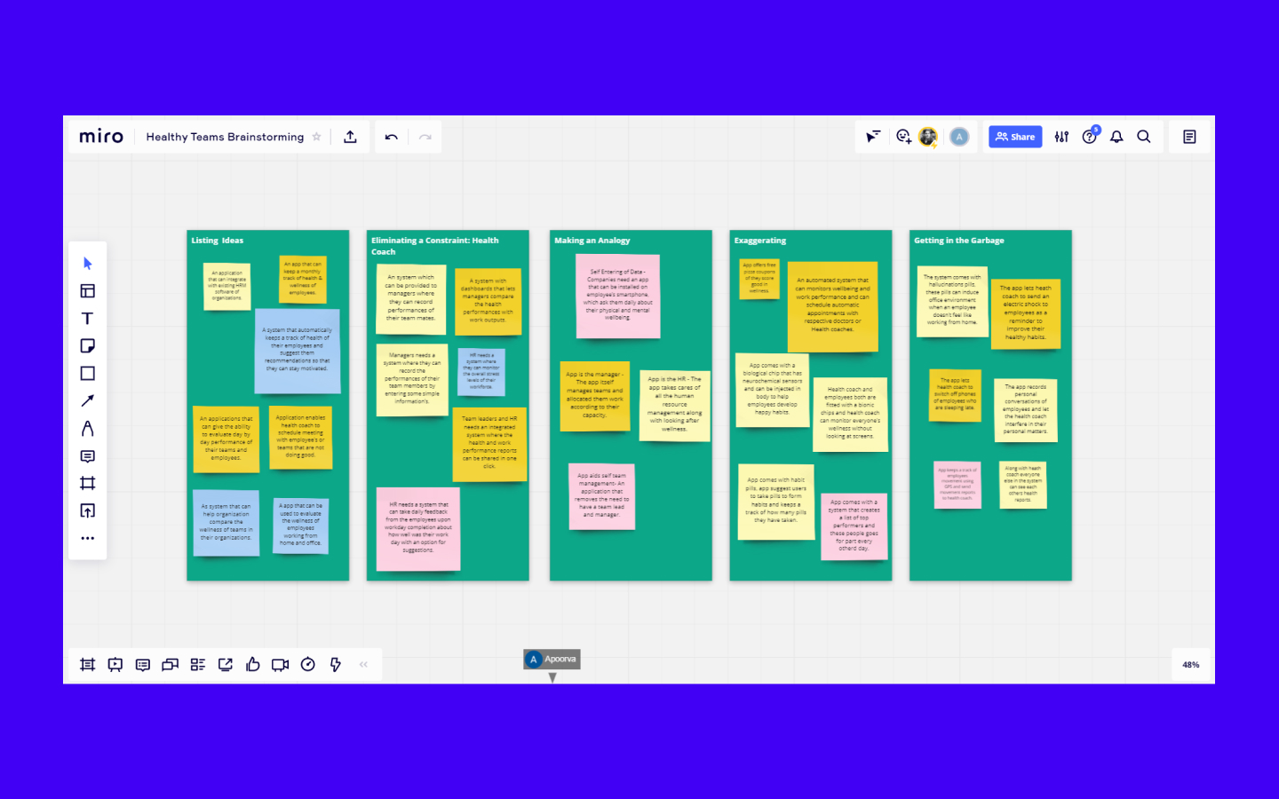
Problem Framing & Research: Conducted 4 qualitative interviews using two different methods: structured remote calls and informal conversational interviews. Identified two critical design constraints: organizational bias (managers misusing health data) and plausible deniability (employees needing autonomy over their time-off reasons).
Key Product Decision: The user of this app is neither an HR manager nor a team lead. It's a dedicated health coach. This decision eliminated bias risk (coaches have no stake in work output) while preserving employee autonomy. This was the single most important strategic decision in the project.
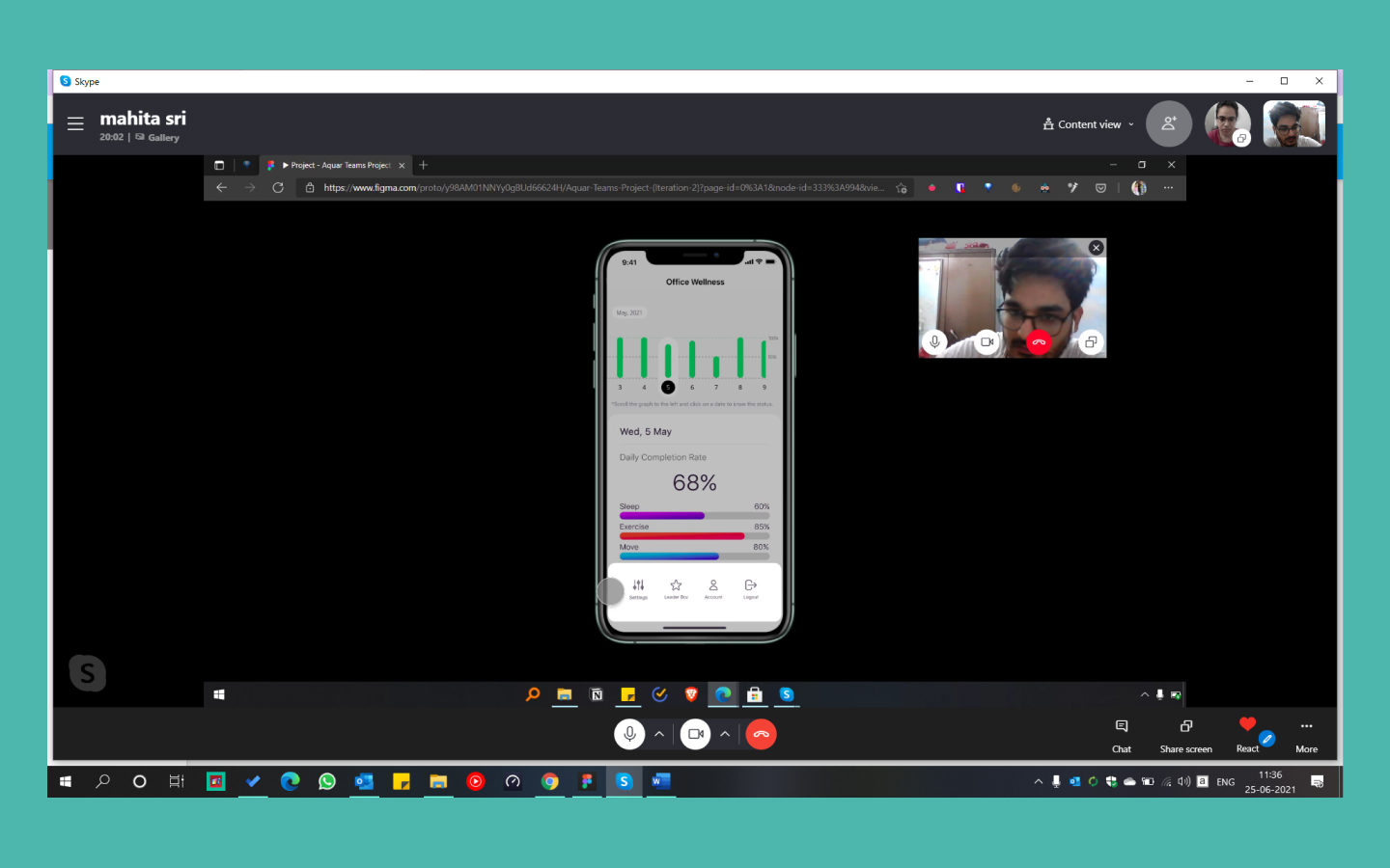
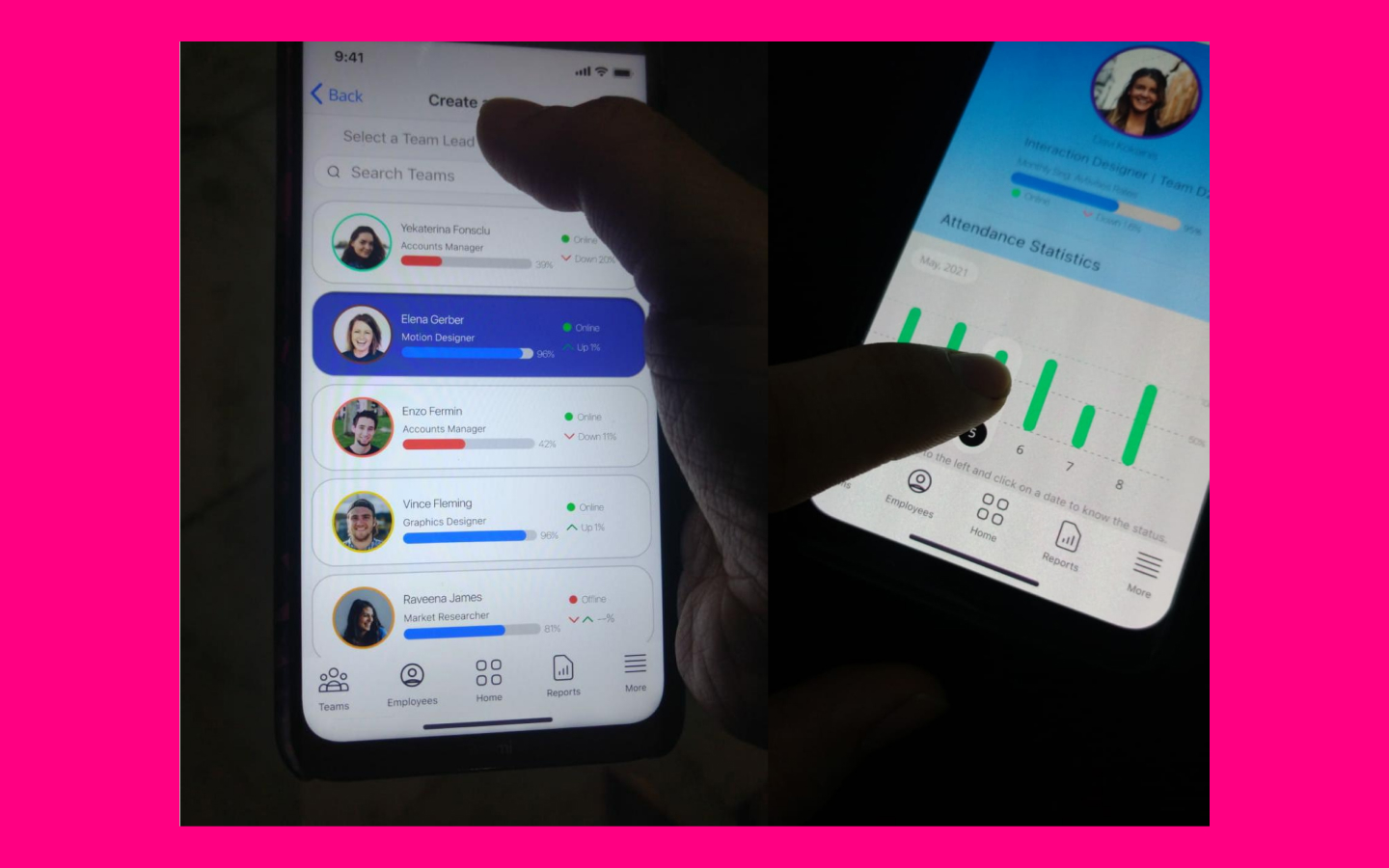
Information Architecture: Structured the product into 3 core modules: Office Performance, Team Performance, and Individual Performance. Each module has progressive drill-down capability, reflecting how a health coach actually evaluates wellness (macro → team → individual).
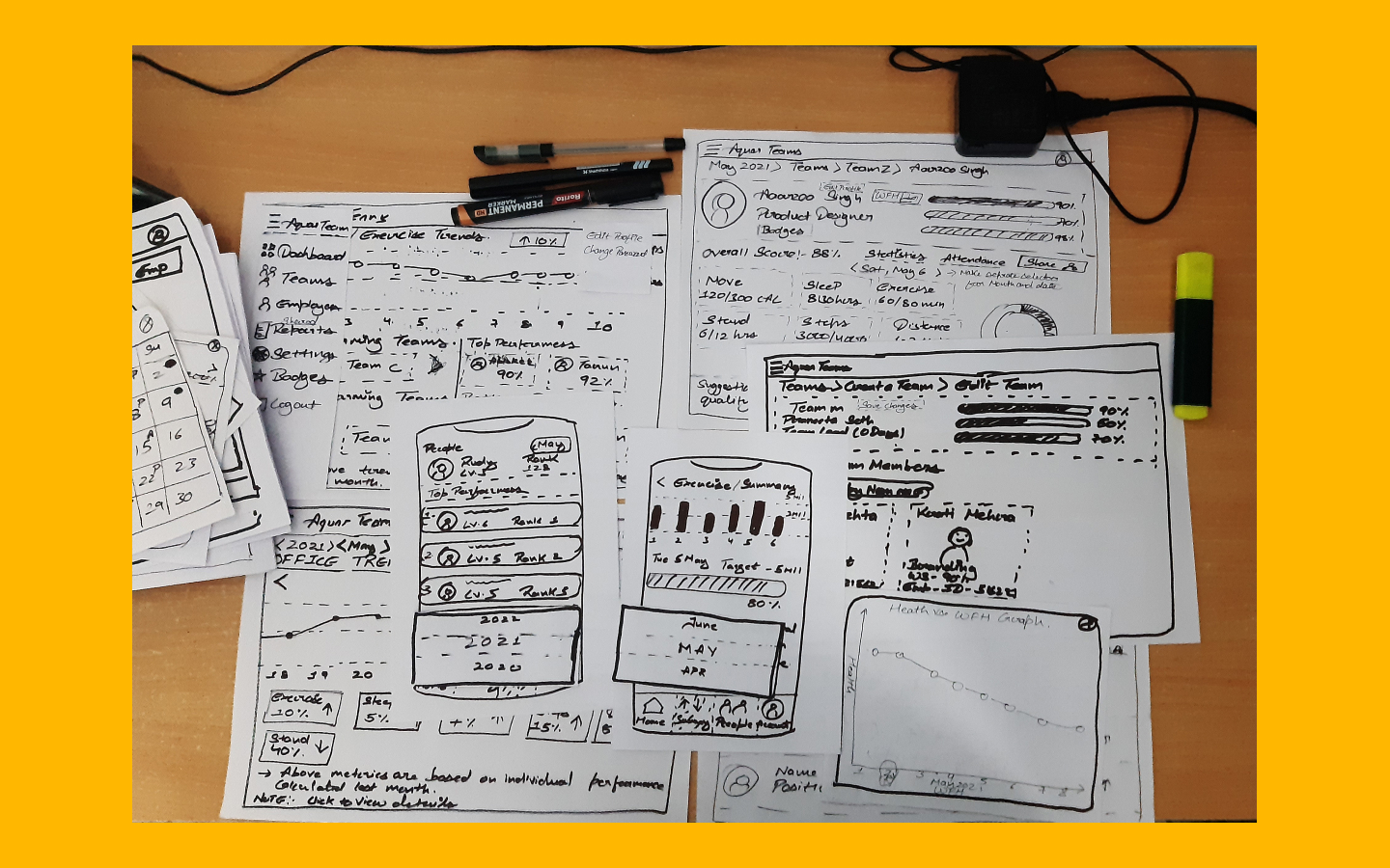
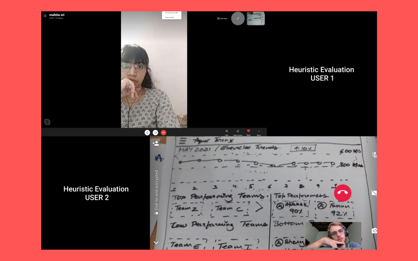
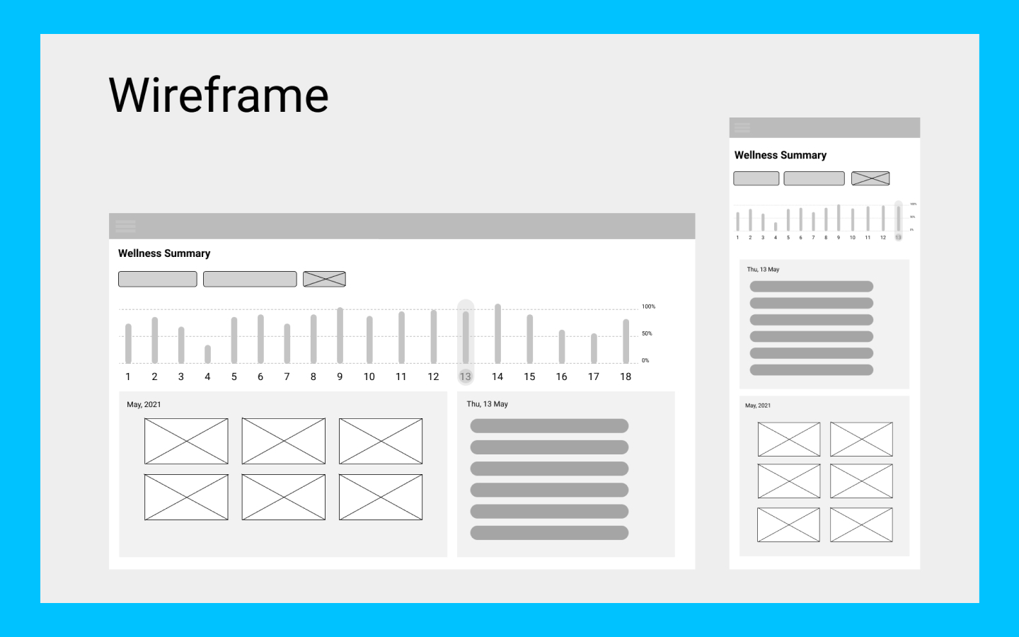
Prototyping & Testing: Built paper prototypes → conducted heuristic evaluation with 2 users (severity-rated violations) → created low-fidelity wireframes → built mid-fidelity interactive prototype → conducted in-person usability testing → ran A/B test on UserTesting.com with 4 users.
A/B Test Result: The alternate design (navigation labels moved to header with increased prominence) significantly improved task completion confidence and reduced user confusion during the "Create New Team" flow.
Validated the core product concept through multiple rounds of user testing. The A/B test confirmed that information hierarchy, not feature quantity, was the key lever for usability in data-dense interfaces. The health coach persona was validated as the right user archetype to eliminate organizational bias while maintaining employee trust.
Why a health coach, not HR?
User research revealed two unavoidable risks: manager bias and loss of employee autonomy. Making a neutral health coach the primary user eliminated both without adding system complexity.
Why progressive drill-down over dashboards?
Health evaluation follows a natural convergence-divergence pattern: start broad (office), narrow to a concern (team), then expand again (individual context). The IA mirrors this mental model.
Why A/B test navigation, not features?
In-person testing showed users weren't struggling with what the app does. They were struggling with where to look. The problem was information hierarchy, not functionality.

.svg)
