As Nir Eyal wrote in his book Hooked, the success of a product depends on how easily it becomes a habit for its users.
I’ve been hooked to Spotify for the past three years and have placed far too much value in my playlists; even after purchasing a paid YouTube music subscription, I still prefer to use Spotify because I’m so used to it and don’t mind listening to ads. I’ve even begun to enjoy their commercials.
Being a Spotify fan, I decided to redesign their app and tried exploring their design philosophy.
Concept Research User interface
2015
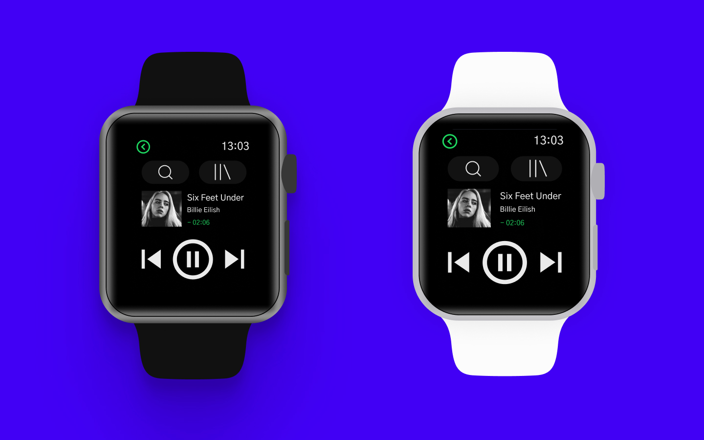
This small project was completed as part of my Interaction Design Specialization last year. This project taught me how to translate the same design language from small screens to large screens, as well as how interactions differ when the screen size changes from a smartwatch screen to a large wall-size screen.
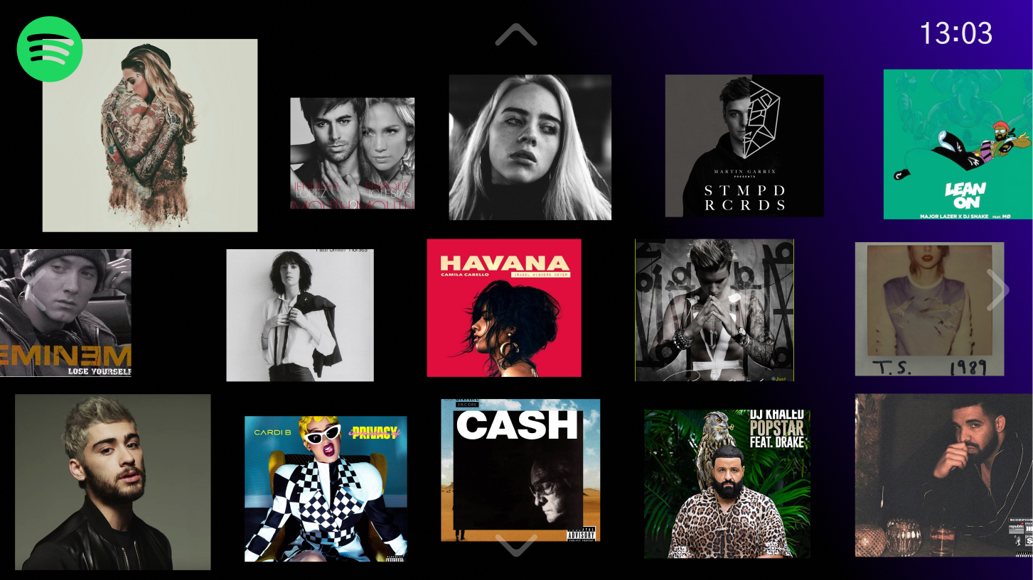
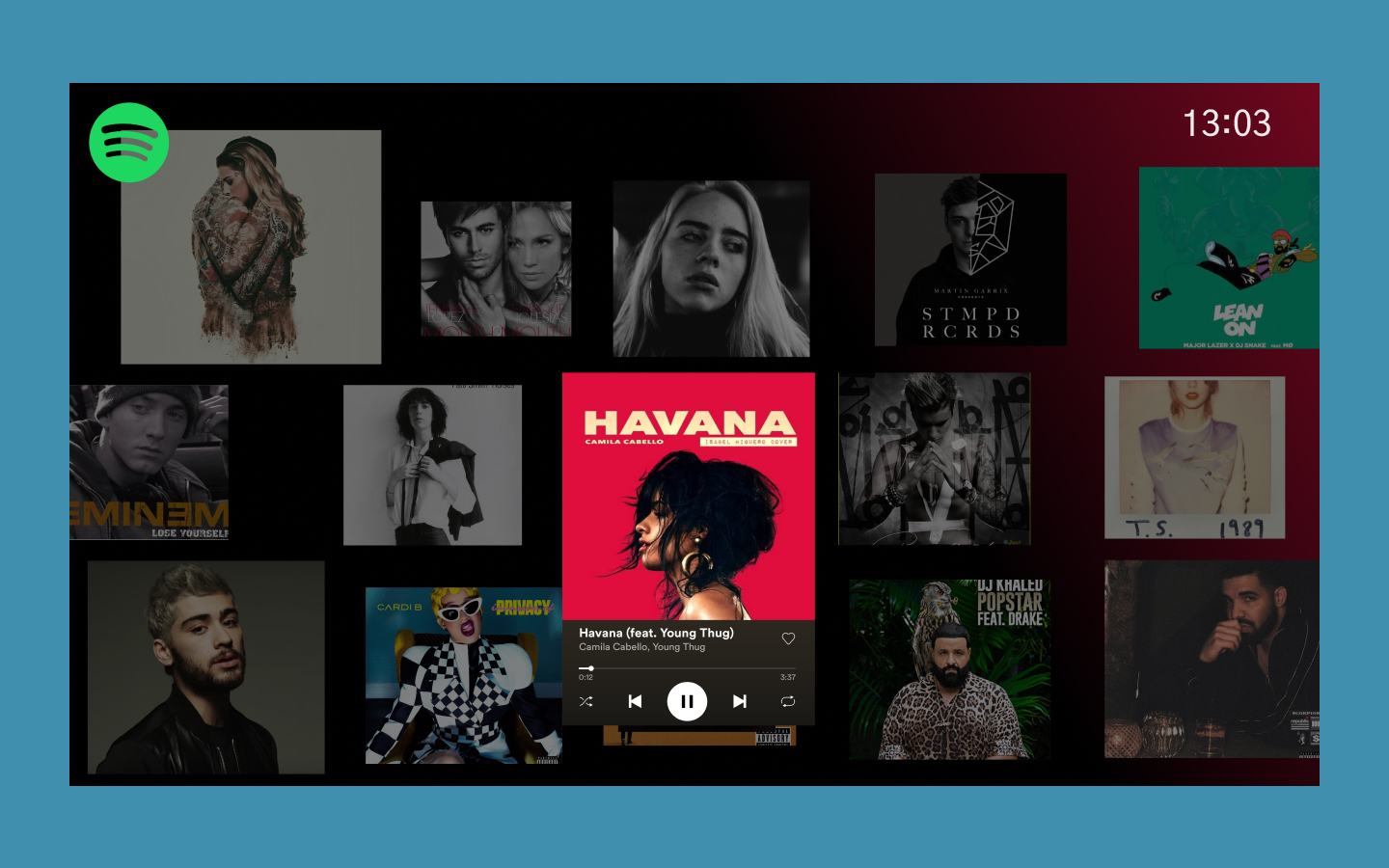
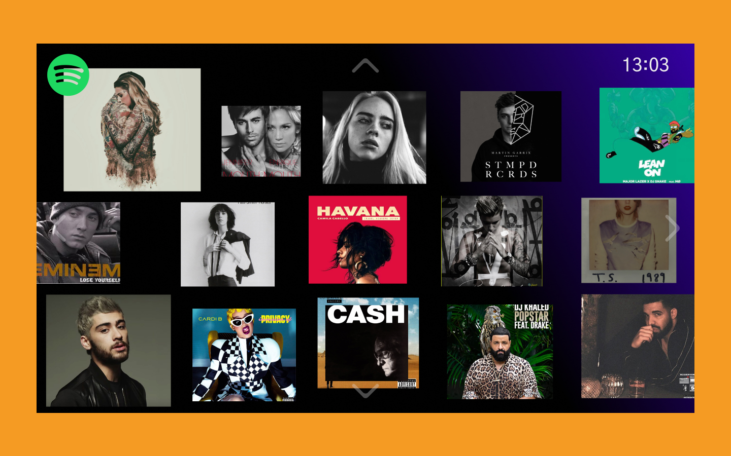
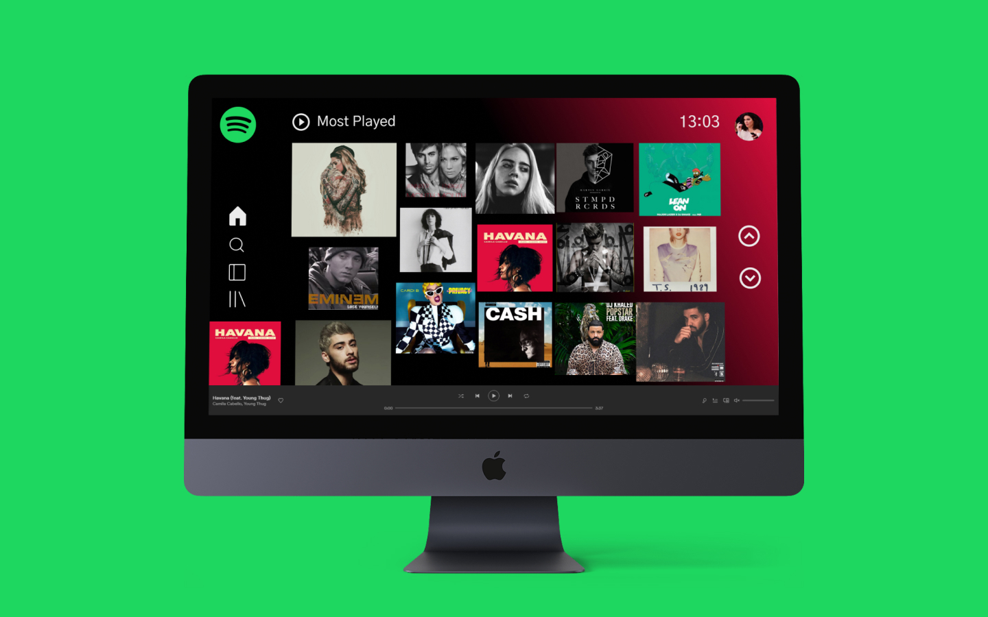
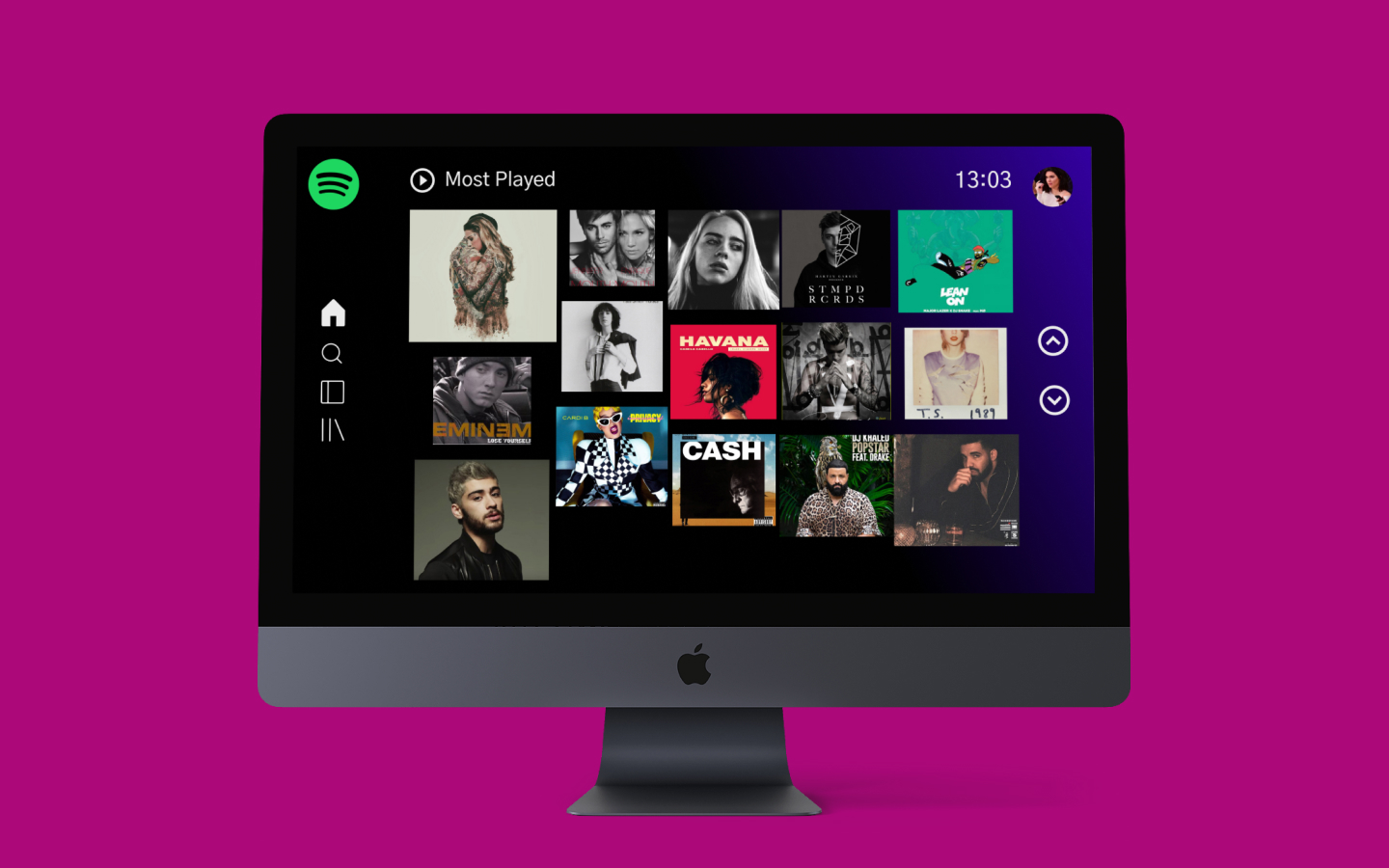
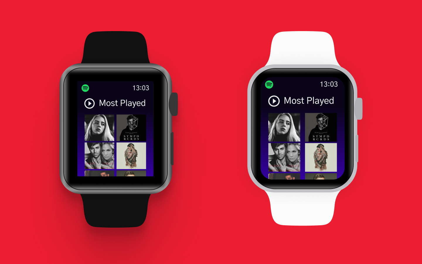
The brief was to create two screens for three different devices. One for a large touchscreen interface on a wall, another for a desktop screen, and a third for a smartwatch.
I started off with few questions in my mind-
a) Have I ever seen a wall touchscreen?
- No
b) What are those places where can I find one?
- It could be a large television in our homes, or it could be seen in public places or arcades.
c) What are some examples of how people use it, and where can I find some?
- I’ll have to look it up on the internet.
First, I did some internet research and looked into wall-interfaces. I found only a few designs but all those were stunning, but one of the most impressive was Google’s Google Play Music, which was designed for a large wall in an exhibition. The wall interface, as demonstrated by Google’s example, was extremely fluid, requiring people to interact with the device using their entire arm movement.
Second, for the overall look and feel of the interface, I drew inspiration from Spotify’s pattern library and studied their logo, icon, and colors to gain a better understanding of how to use them. Then I gathered album art from my favorite artists, making sure to keep the contrast of colors, position, and size to differentiate it from the existing Spotify app, which is far too functional.

.svg)
