Elwood is a New York based musical artists collaboration platform. Artists from anywhere can use it to connect, work together from far away, and make awesome music. The brief was to redesign a crucial module of the app by making it more intuitive.
Strategy User research UX design
1 × project manager 2 × engineers
2023
Opportunity to work on this platform came later in 2023; client was facing a roadblock within a few modules of the App design where the client was looking out for more intuitive user experience compared to what they have been already designed.
So basically, this was app redesign project where client needed a modern intuitive design that complements the overall UX of the app.
We scheduled a meeting with the app founders the very next day; the idea was to —
- Understand the bigger picture of the app!
- Get to know the users and what are they supposed to accomplish.
- How is the user going to interact with the app?
- Where they stand currently and what have they planned for the future?
I also asked the founders on what they are expecting and how do they want their users to feel when they interact with the app.
This is the most crucial question in any UI/UX project because as an app designer it is necessary to design something that the client really wants but also something that is loved by the users and is equitable to multiple devices. Through this question, I came closer to their expectation and also in the position to suggest them what might work or what might not work out.
Being a music lover, I wanted to make sure this app looks and feels no less than the ones already available in the market, I started using my imagination on different design concepts. Over the next 2 days, I analyzed a few music collaborations apps like podcasters, Sound traps etc.
But there was limitation! It was only a re-design project, so I had to redesign everything keeping in mind the elements that are already in place in other modules of the application.
I have always loved the concept of using real world metaphors in app design. All the applications be it social media, music, food delivery, or shopping, one thing is common that all of these apps UX environments are created keeping in mind the real-world environments. So, I decided to do with this app design!
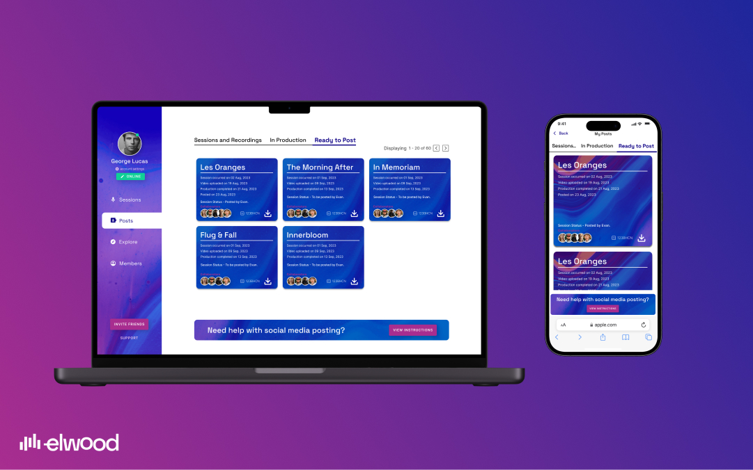
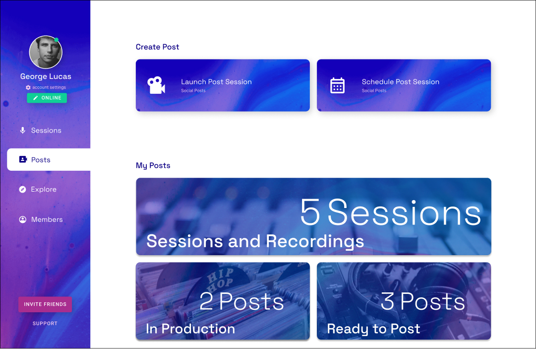
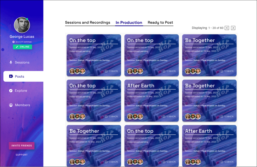
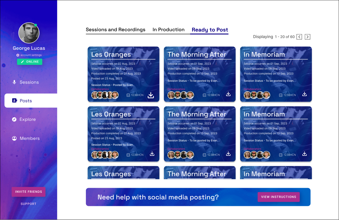
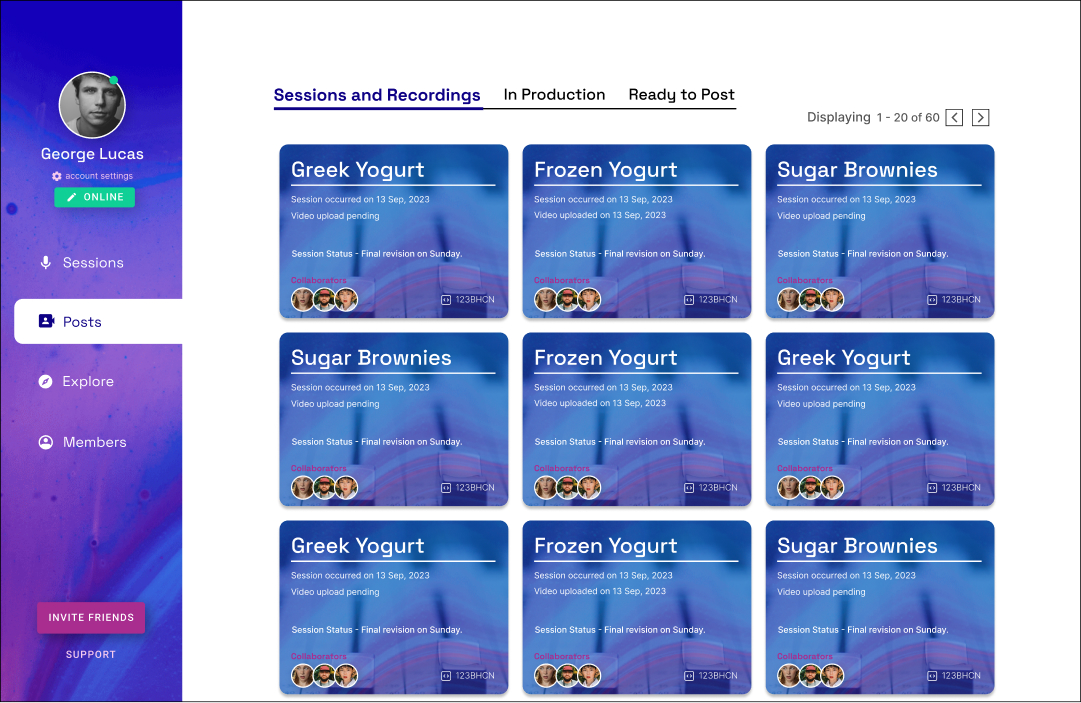
Elwood’s “My Posts” module has 3 sub modules, namely Sessions and Recording (Where users would keep all the recorded sessions), In-production (Where users will move a track into production), and the third category is Read to Post (Where users would keep the final track ready for the release).
Based on feedback taken during the meeting, I gave visual hierarchy to all the 3 categories both in terms of screen real estate and order of arrangement. Session and Recording has to be accessed by users the most, so I made the card bigger in size making it easier for users to access this category, this also facilitated the concept of recognition over recall. The remaining 2 category i.e. In-production and Ready to Post were arranged in order by prioritizing In-production over ready to post.
Now came the Metaphors, all of these 3 categories were serving different purposes and has to be given different environments. Since, Sessions and Recordings usually takes place inside studios, I gave it a picture treatment of a studio sound mixer. This was applied to the main card and all the secondary cards when a user would enter the Sessions and Recordings category. Creating this environment will automatically tell the users mind that they are in the studio and dealing with instrument. Similarly, I gave an environment of a record gallery to In-production and a radio station environment to tracks that are ready to post. All of these background picture treatments were given as per the Elwood’s brand guidelines.
Creating these environments not only served the purpose of metaphors or the concept of recognition over recall. The main ideas were to give this app a look and feel of a music app as well as to ensure that these elements are equitable to all the mobile devices as well as serves the evolution of application.
These background pictures will also be serving the purpose of album arts as well as to create visual hierarchy of multiple music genres when the application evolves in coming years.
Apart from these I used a switchable tab to make it easy for users to switch between the categories instead of having to go back and re-enter another category. Here again, I used the metaphor of rooms, it’s like visiting different rooms without actually having to go out.
Well, that’s the magic of designing a virtual world!


Client really loved the final outcome, and they immediately took the design forward for development.

.svg)
